Say store conversion fell from 32% to 21%. The first thing said in the review is almost always "when did we last touch the screenshots?" Then you split by source and find that neither Search nor Browse moved at all. Observed source rates held while the total fell; this does not establish that the page is optimal.
This post is about telling those two situations apart. The fixes are opposites, so neither can be applied while they are blended together.
The blended rate contains two different movements
Store conversion is usually read as installs over product page views. Inside that single number sit two movements of completely different character.
- Efficiency — per-source conversion itself changed. The share of people who install after viewing the page moved.
- Mix — per-source conversion held, but the weighting changed. More people arrived through a lower-converting door.
Both pull the blended rate down identically. The symptom on screen is the same. But an efficiency change can also reflect within-source intent, device mix, or measurement changes. These components narrow the investigation rather than uniquely identify the fix.
The arithmetic makes it obvious
Compare the first three weeks of a six-week period against the last three. Two sources will do.
| Views (earlier) | Rate (earlier) | Views (later) | Rate (later) | |
|---|---|---|---|---|
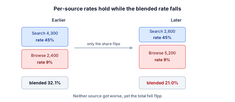
| App Store Search | 4,300 | 45% | 2,600 | 45% |
| App Store Browse | 2,400 | 9% | 5,200 | 9% |
Per-source conversion is 45% and 9% in both periods. Not one source got worse.
Now total it up.
- Earlier: installs (4,300×0.45) + (2,400×0.09) = 1,935 + 216 = 2,151 on 6,700 views. Rate 32.1%
- Later: installs (2,600×0.45) + (5,200×0.09) = 1,170 + 468 = 1,638 on 7,800 views. Rate 21.0%
An approximately 11.1pp drop. Views actually rose by 1,100 while installs fell by 513. This does not predict the effect of changing screenshots, because the only thing that moved was Browse's share of views going from 36% to 67%.
For the more extreme case where every source improves and the total still falls, see Simpson's paradox, which works on the same principle.
Nothing worsening in the parts while the whole worsens is the same structure statisticians call Simpson's paradox. When the weights move, the average can travel opposite to every component.
The reverse case is just as dangerous
Flip it. If shares hold while Search conversion slides from 45% to 38%, that probably is a page problem — a screenshot swap, a ratings drop, a jump in app size, a store policy change.
Waving it away as "Browse traffic must have grown" means missing something you genuinely need to fix. The two causes make convenient alibis for each other.
Check the tool’s decomposition unit
The conversion-rate difference in percentage points and the tool’s components have different units. The tool uses its existing PVM engine to decompose views per install (views ÷ installs, the inverse conversion rate). Weights are install shares, not view shares.
For source-level views per install r₁, r₂ and install shares s₁, s₂, with a bar denoting the arithmetic mean of the two periods:
- Mix term =
(r̄ − mean overall views per install) × (s₂ − s₁) - Efficiency term =
s̄ × (r₂ − r₁)
With the same source set and valid denominators, the summed terms equal the change in views per install. Do not add them to a conversion-rate change or label them percentage points. Check support and withheld reasons for entering or exiting sources and zero installs.
Splitting it with the tool
To run this on a CSV directly, use ASO Store Conversion Analysis. Upload the Source Type report from App Store Connect or the traffic source report from Google Play Console as-is.
It halves the period, compares the two, and states whether mix or efficiency drove the change. You also get the per-source rate and share table plus a daily trend chart, so you can see whether the change broke on one date or drifted.
Reading the trend chart is simple: dashed per-source lines running parallel while the solid blended line falls means mix; dashed lines falling together means the page.
What to do once it is split
When mix is the cause. Start with why the composition changed. Paid scaling raising Browse impressions, a featuring placement, and seasonality all call for different responses. Conversion itself is healthy here, so retargeting the goal at installs rather than conversion rate is often correct — more volume through a lower-converting door is not automatically bad.
When efficiency is the cause. Narrow down which source fell. An even drop across all sources points at page elements or ratings; a drop confined to one source means that source's traffic intent changed. A Search-only drop most often means you newly ranked for keywords that do not match the app.
Try this today
- Export the last six weeks from your store console, split by source type (or traffic source).
- Compute per-source conversion for the first three weeks and the last three separately. Whether those per-source numbers moved answers half the question on its own.
- If mix turns out to be the cause, check the calendar for spend or placement changes in that window.
Limits of this approach
This decomposition narrows where to look; it does not establish cause. The tool’s mix term describes weighting-related change in views per install — not why the weighting moved. If paid scaling, a featuring placement, and seasonality all landed in the same window, this table cannot separate them.
Confirming that a screenshot or icon change worked requires a store experiment, not observational data. Testing whether paid traffic displaces organic is a job for incrementality analysis.
Halving the period is itself an assumption — nothing guarantees the change happened at the midpoint. Look at the trend chart first, find the date it actually broke, then re-split around that point.