Every so often a weekly report produces a strange table. Each campaign's conversion rate went up, yet the total row at the bottom went down. It is not a formula error. Statisticians call it Simpson's paradox, and in paid acquisition it happens more often than people expect.
This article shows how to read that table and how to report the total change as two parts: volume shifting between campaigns, and change within campaigns.
Start with the numbers: both rose, the total fell
Take the share of installs that went on to a first purchase, across two campaigns. A is high-intent brand search; B is a broad prospecting campaign looking for new users.
| Campaign | Week 1 installs | Week 1 purchases | Week 1 rate | Week 2 installs | Week 2 purchases | Week 2 rate |
|---|---|---|---|---|---|---|
| A Brand search | 4,000 | 400 | 10.0% | 2,000 | 220 | 11.0% |
| B Prospecting | 1,000 | 20 | 2.0% | 6,000 | 150 | 2.5% |
| Total | 5,000 | 420 | 8.4% | 8,000 | 370 | 4.6% |
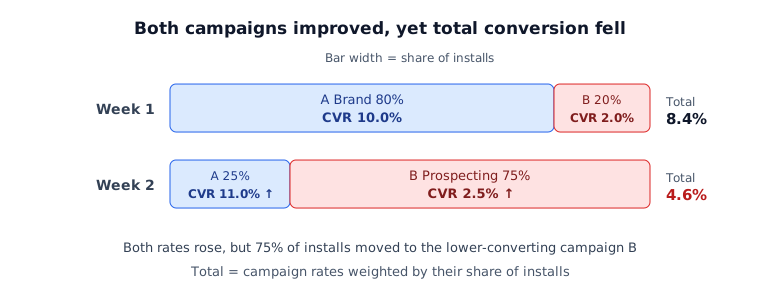
A rose from 10.0% to 11.0% and B from 2.0% to 2.5%. The total nearly halved, from 8.4% to 4.6%.
Why it happens: the weights of the average changed
The total rate is the campaign rates weighted by each campaign's share of installs. In week 1, 80% of installs came from A at 10%. In week 2, 75% came from B at 2.5%.
Each campaign did better, but far more weight now sits on the lower one. Read only the total and it looks like conversion collapsed; read only the campaigns and everything improved. Both are true, and reporting either one alone tells half the story.
The same structure is not limited to purchase rates. When app store conversion falls because of traffic-source mix, see app store conversion drop diagnosis; when cost per install rises because of channel mix, see ad performance drop diagnosis.
Split the change into three parts
The total change (−3.8 pp) splits into three parts exactly, with no residual, so you can copy it straight into a report.
- Volume shift: hold each campaign's rate at week 1 and change only the install shares
- Within campaigns: hold the install shares at week 1 and change only the campaign rates
- Overlap: what remains because shares and rates changed together
| Campaign | Install share (week 1 → 2) | Volume shift | Within campaign | Overlap |
|---|---|---|---|---|
| A Brand search | 80% → 25% | −5.5 pp | +0.8 pp | −0.6 pp |
| B Prospecting | 20% → 75% | +1.1 pp | +0.1 pp | +0.3 pp |
| Total | −4.4 pp | +0.9 pp | −0.3 pp |
The three totals add to −4.4 + 0.9 − 0.3 = −3.8 pp, matching the total change. In this example the whole drop came from the volume shift; inside the campaigns, conversion actually improved by 0.9 pp.
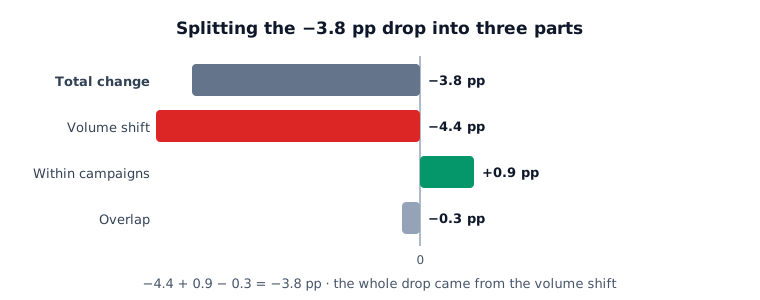
For each campaign: volume shift = (week 2 share − week 1 share) × week 1 rate; within campaign = week 1 share × (week 2 rate − week 1 rate); overlap = share change × rate change. With more campaigns, compute the same terms row by row and add them up.
How to write it in the report
A single total line sends readers to suspect creatives or the landing page. In the example above, neither is where the work is.
- Avoid: "Purchase conversion fell from 8.4% to 4.6%. Investigating the cause."
- Write: "Purchase conversion fell from 8.4% to 4.6%. The 3.8 pp drop reflects installs moving to the prospecting campaign (−4.4 pp); both campaigns' own rates rose (+0.9 pp)."
The second version settles the next questions right away: was the move toward prospecting a deliberate decision, and do the extra installs pay off even at a lower purchase rate? For judging volume shifts against outcomes, see marginal-efficiency budget allocation.
Three signs that composition changed
- The total metric moved a lot while campaign or channel metrics barely moved, or moved the other way
- The same week had a budget change, a bidding change, a new campaign, or wider automated allocation
- Volume shifted between user groups with different profiles, such as gender, age, country or OS
The third sign means the same thing happens on user-attribute axes, not only campaigns. If an age group with high conversion shrinks, the total falls even when every age group converts as before. Repeat the same calculation one axis at a time to find where composition moved most.
The split alone does not prove the cause
The three-part split tells you where the change happened, not why. Whether volume moved to prospecting because of a budget change, a platform algorithm or a shift in market demand has to be checked against the operating log.
Sample size matters too. A 0.5 pp change in a campaign with a few dozen purchases may be chance. If the within-campaign part is small, "no clear change" is more accurate than "improved". For separating correlation from causation, see correlation vs causation.
In next week's report, put each campaign's install share next to the total metric. One share column is enough to make Simpson's paradox visible in the table. The weekly ad performance report template has a layout you can reuse.