"Subscribers leave after 2.8 months on average." When a line like that shows up in a report, it is worth a second look. That average most likely includes only people who already left and excludes people who are still subscribed. Dropping the long-lasting users always makes churn look earlier than it is.
This article walks through the honest way to calculate when users leave, the survival curve (Kaplan–Meier estimate), using a ten-user example you can follow by hand. The same method applies to subscription cancellation, repeat purchases stopping, or use of a key feature ending.
Why the average churn time is wrong: users who have not left
Suppose we have ten subscription records. As of today, five have cancelled and five are still subscribed.
| User | Time retained so far | Status |
|---|---|---|
| 1 | 1 month | Cancelled |
| 2, 3 | 2 months | Cancelled |
| 4 | 3 months | Active |
| 5 | 4 months | Cancelled |
| 6 | 4 months | Active |
| 7 | 5 months | Cancelled |
| 8, 9, 10 | 6 months | Active |
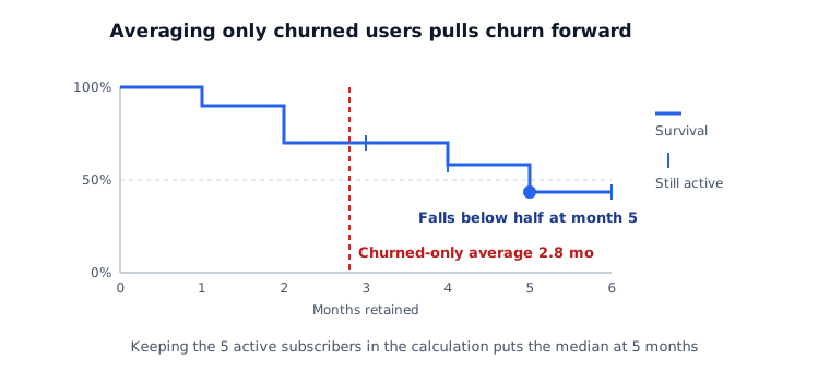
Averaging the five cancelled users gives (1 + 2 + 2 + 4 + 5) ÷ 5 = 2.8 months, which is where the opening "2.8 months on average" comes from. The three users still active at month six never entered that calculation. Averaging all ten gives 3.9 months, and even that is too short, because the five active users will keep going.
A user who has not left only tells you they lasted until observation ended. This is called censoring. The survival curve uses that information without discarding it and without turning it into a cancellation.
How the survival curve is calculated
Each month, ask how many of the users active at the start of the month left during it. Multiply the share who stayed into the previous month's survival.
| Month | Active at start | Cancelled | Monthly churn risk | Survival |
|---|---|---|---|---|
| 1 | 10 | 1 | 10% | 90.0% |
| 2 | 9 | 2 | 22% | 70.0% |
| 3 | 7 | 0 | 0% | 70.0% |
| 4 | 6 | 1 | 17% | 58.3% |
| 5 | 4 | 1 | 25% | 43.8% |
| 6 | 3 | 0 | 0% | 43.8% |
In month three, one user (user 4) reached the end of observation while still active. That user is not counted as leaving; they simply drop out of the denominator from month four, which is why month four starts with six.
Survival first falls below 50% in month five, so the median survival time is five months — nearly double the 2.8-month average of cancelled users.
Find when churn risk rises
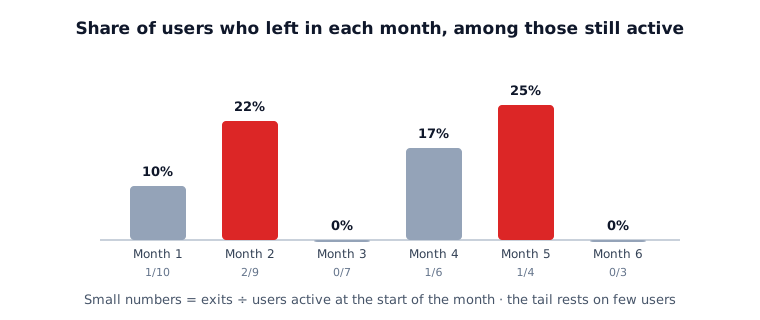
If the survival curve shows how many remain, the monthly churn risk column shows the chance that someone still active leaves this month. That value is the hazard. In the example, risk peaked in month two (22%) and month five (25%).
The difference leads to different actions. Risk concentrated in month two points to the stretch before the second payment. Month five points to long-term users losing interest. Send reminders, offers or feature guidance a step ahead of the month where risk jumps, so there is a chance to see whether they worked.
How it differs from D1, D7 and D30 retention
D1, D7 and D30 cohort retention asks whether a user came back on a fixed day after signing up. Rows line up by signup date, so recent signups have an empty D30 cell and drop out of that calculation.
A survival curve looks at when a user first stopped. Users with different observation lengths each contribute as much as was observed. That makes it especially useful for a newly launched feature or a recently opened subscription, where few users have been watched for long.
| Cohort retention | Survival curve | |
|---|---|---|
| Question | Did they return on a set day? | When did they first stop? |
| Users not yet fully observed | Dropped from that cell | Counted up to their observed time |
| Good fit | Visit and activity logs | Cancellation, repeat purchases ending, feature use ending |
From result to action
- Start with the overall median survival and the months where risk is high.
- Split the curve by channel or first-action type. Use a log-rank test to check whether gaps between curves are more than chance.
- Also report the average time retained within a fixed horizon (for example, six months). In the example it is 4.3 months within six. This value still works for comparison when too many users remain to reach a median.
If retention differs by channel, choosing channels on acquisition cost alone is not enough. For weighing retention against acquisition cost, see CAC payback period and LTV:CAC ratio.
What distorts the result
- Without a single observation end date, "active" stops meaning anything specific. Record the date the data was pulled.
- Censoring must be unrelated to churn. Keeping accounts suspended for payment failure as "active" overstates survival.
- The tail swings widely because few users remain. Month six in the example rests on three people, so draw no conclusion from that stretch.
- A survival gap between channels may not be caused by the channel, because each channel brings different users. Checking the cause needs a design with a control group, as in incrementality measurement.
In next month's report, replace "average churn time" with the median survival time and the months where churn risk is high. If many users are still active, state the observation window, as in "more than half retained through month six of observation."